
Show or hide the control bar
On the Tour tab, open Tour UI and use the Control Bar switch.
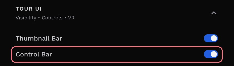
Hiding it also hides its floorplan, dollhouse and map buttons, so visitors can only reach those through hotspots. The editor asks you to confirm.
Add the Control Bar block
- Choose + Add at the top left of the editor.
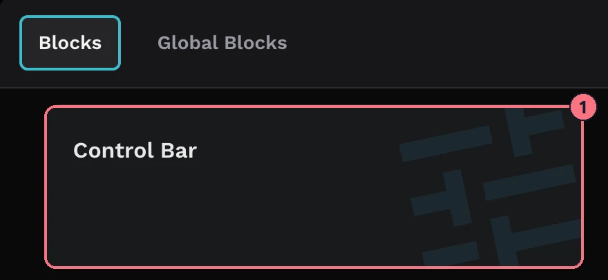
- Choose Control Bar (1), then Add on its card. Its settings open on the right.
To come back to it later, choose Customize next to the Control Bar switch in Tour UI. Every change saves as you make it.
Control Bar UI: position and size
- PositionWhere the bar sits: Top Right, Top Left, Bottom Right, Bottom Left, Top Center, Bottom Center, Right Center or Left Center.
- OrientationVertical (a column of buttons) or Horizontal (a row).
- FixedKeeps the bar at a fixed size instead of letting it scale. Turning it on adds a Size slider.
- SeparateShows each button as its own floating button instead of one joined bar.
- TooltipShows each button’s label when visitors hover over it.
- Button Width, Button Height, Icon SizeSliders from 0 to 100.
- MarginSpace between the bar and the edge of the tour, 0 to 150. The slider sets all four sides; the button next to it sets top, right, bottom and left separately.
- Border RadiusHow rounded the corners are, 0 to 24.
- Button Border Width0 to 30.
Buttons: choose, edit and reorder
Under Buttons, each button has its own row:
- Turn a button on or off with the switch on its row.
- Change its icon or tooltip: click the row to open it, choose the icon to pick another, and type the tooltip text. The button must be switched on to edit it.
- Buttons with two states are marked 2 states and have a second icon and tooltip: Sound (pause and play), Orientation (gyroscope on and off) and Fullscreen (enter and exit).
The buttons are Previous and Next (the previous or next panorama), Sound, Orientation, Fullscreen, Info, Screenshot, VR, Dollhouse, Map, Floorplan and Share. A few only appear once the feature is on: Fullscreen, Info and VR follow their switches in Tour UI, and Dollhouse, Map and Floorplan appear when the tour has that block (the Floorplan button when the floorplan is shown as an icon).
Reorder opens Reorder Control Bar Buttons: drag the buttons into the order you want, then choose Save.
Add your own button
- Under Buttons, choose Add Button. A button called “Custom 1” is added at the end of the bar.
- Type its name, and choose an icon as for any other button.
- Next to Action, choose Choose… and pick what it opens: a panorama or block in this tour, a file from your media, an integration such as a form or chat, a Smart Bubble, a web address or a QR code.
To delete a custom button, open its row and use the delete icon next to its name.
Colors
Set the Icon Color, Background Color and Border Color for every button on the bar.
Go back to the standard bar
At the bottom of the block’s settings, choose Remove Block and confirm. The tour goes back to the standard control bar.
Tips
- Using a floorplan or dollhouse? Keep the control bar showing, or add hotspots that open them, so visitors can still find them.
- Only want to hide the panorama thumbnails? That’s the Thumbnail Bar; see Remove the thumbnail bar.
- To reuse your control bar in other tours, save it as a global block.
Common questions
Can I add my own button to a virtual tour’s control bar?
Yes. Add the Control Bar block, then choose Add Button under Buttons. A custom button can open a panorama or block, a file from your media, a form or chat integration, a Smart Bubble, a web address or a QR code.
How do I hide the control bar?
Turn off Control Bar in Tour UI on the Tour tab. Hiding the control bar also hides its floorplan, dollhouse and map buttons, so the editor asks you to confirm.
Can I move the control bar to the top of the screen?
Yes. In the Control Bar block’s settings, Position puts the bar in any corner or in the middle of any edge, and Orientation makes it a row or a column.
Why doesn’t the Floorplan button show?
The Dollhouse, Map and Floorplan buttons only appear when the tour has that block, and the Floorplan button only when the floor plan is shown as an icon. See Floorplan.